Designing for Notifcation Fatigue
Co-designer of the framework, low-prominence surface advocacy and partner team onboarding and guidance.
2 Designers, 1 Motion Designer, Senior Design Manager, Group Principal Design Manager
Shipped
Edge had a notification problem. Feature teams across Shopping, Wallet, Sidebar, NTP, and Browser Essentials were shipping notifications independently. Each team optimising for their own metric with the most prominent surface available.
Notifcations were fragemented and inconsistent with no clear guardrails on visual language, prominence or frequency.
The result was a browser that felt like it was constantly interrupting browsing sessions. Users cited too many pop-ups as a top NPS detractor, directly impacting Edge retention.
The problem wasn't a single notifcation but the absence of a system.
Users were pretty vocal about their frustration showcasing the sentiment publicly online. The notification overload was the top NPS detractor in 2022.

Co-designer on a focused team of two designers contributing to both framework and component library building and its adoption, working directly with the a senior design manager and the group principal manager of Edge design.
We mapped the problem space. We identifed core notification pain points across Edge surfaces ranging from visual inconsistency and cognitive overload to lack of user control and poor contextualization.

Every partner team had their own goals, their own timelines, and their own definition of success which usually measured by CTR.
Larger surfaces got clicks. Click-bait content got clicks. This was driving every team towards using the most prominent surface available.
The core design challenge wasn't just coming up with a system of components. It was changing the how teams thought about notification surfaces. By bringing in the right guidance on when to use what, and why restraint leads to better outcomes for both users and the product.
Arrived at through rounds of proposals, critique sessions, and daily standups with the design manager and head of Edge design. Each review sharpened what the framework needed to be.
1.
2.
3.
Guide partners to the right surface
Optimized existing surfaces
Following are the efforts around media guidance and size reduction.



Introduced low prominence surfaces
Brought in surfaces like the ripping dot, tear drop notification, badges and other subtle surfaces.

Guidance for partners for adoption
To scale the framework across teams, we built self-serve guidance that partner teams could use independently. This covered the decision framework for surface selection, trigger rules, content standards and all the required resources to ship a notification. The goal was to make the right choice, without needing design in the room.


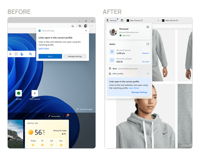
The following are some notification examples mapped to the right surface based on relevance and urgency. The Before and After shows how the same communication becomes less intrusive and more considered without losing its intent.
Non Relvant + Non Time sensitive
Decision tree recommended a low prominence surface. The Communication is directly related to the
It’s an FYI communication
Relvant + Non Time sensitive
Decision tree recommended medium prominence surface. It’s a brand promotional message, hence uses a thumbnail instead of a large image with a light CTA

Relevant + Time sensitive
Decision tree recommended a medium prominence surface. Provides a lesser interruptive experience, it teaches a user only on user interest. Reduces occlusion
